Music Graph Project: Visualizing Genre Connections
tonight Claude.ai and I worked on building out the visualization for the project. I have very minimal javascript experience so I had the LLM explain everything it could. We moved a loop into pure python becuase it seemed overly complex in the template using jinja2. Below is the post detailing tonights journey generated by cluade with minor edits from me. Code release from this session
Got the graph visualization working today. Genres now display as an interactive network diagram instead of just cards and lists.
Choosing a Visualization Library
Since I needed to render a connected graph in the browser, I researched JavaScript visualization libraries. The main options were D3.js (powerful but complex), Cytoscape.js (graph-focused), and Vis.js (easier to use with good defaults).
I went with Vis.js for Phase 1. It’s straightforward to implement and handles network graphs well. I can always switch to something more powerful later if needed.
Why This Made Sense
Before moving into presales, I spent 20 years as a network engineer working with routers, switches, BGP, OSPF, and network automation. I’ve drawn countless network topology diagrams.
This music graph is conceptually identical:
- Nodes = devices (or in this case, genres)
- Edges = links/connections between them
- Layout algorithms = positioning logic
The Vis.js API maps directly to how I think about network diagrams. Instead of routers and switches, I’m visualizing music genres and their relationships.
Implementation
Added Vis.js via CDN:
<script src="https://unpkg.com/vis-network/standalone/umd/vis-network.min.js"></script>
Converted genre data to graph format: The tricky part was avoiding duplicate connections. Since my data has bidirectional relationships (Rock connects to Metal, Metal connects to Rock), I needed to deduplicate.
Instead of complex Jinja2 template logic, I handled it in Python:
def get_unique_connections(genres):
    """Get unique connections (avoid duplicates)"""
    connections = set()
    for genre_id, genre_data in genres.items():
        for connection in genre_data['connections']:
            edge = tuple(sorted([genre_id, connection]))
            connections.add(edge)
    return list(connections)
This creates a set of sorted tuples, automatically removing duplicates. Pass it to the template, and Jinja2 generates clean JavaScript.
Rendered the graph:
var nodes = new vis.DataSet([/* genres */]);
var edges = new vis.DataSet([/* connections */]);
var graph = new vis.Network(container, {nodes, edges}, options);
Vis.js handles the layout, physics simulation, and interactivity automatically.
Current State
The graph displays all genres as green circles with connections between them. You can:
- Drag nodes around
- Zoom in/out
- Pan the canvas
Screenshot
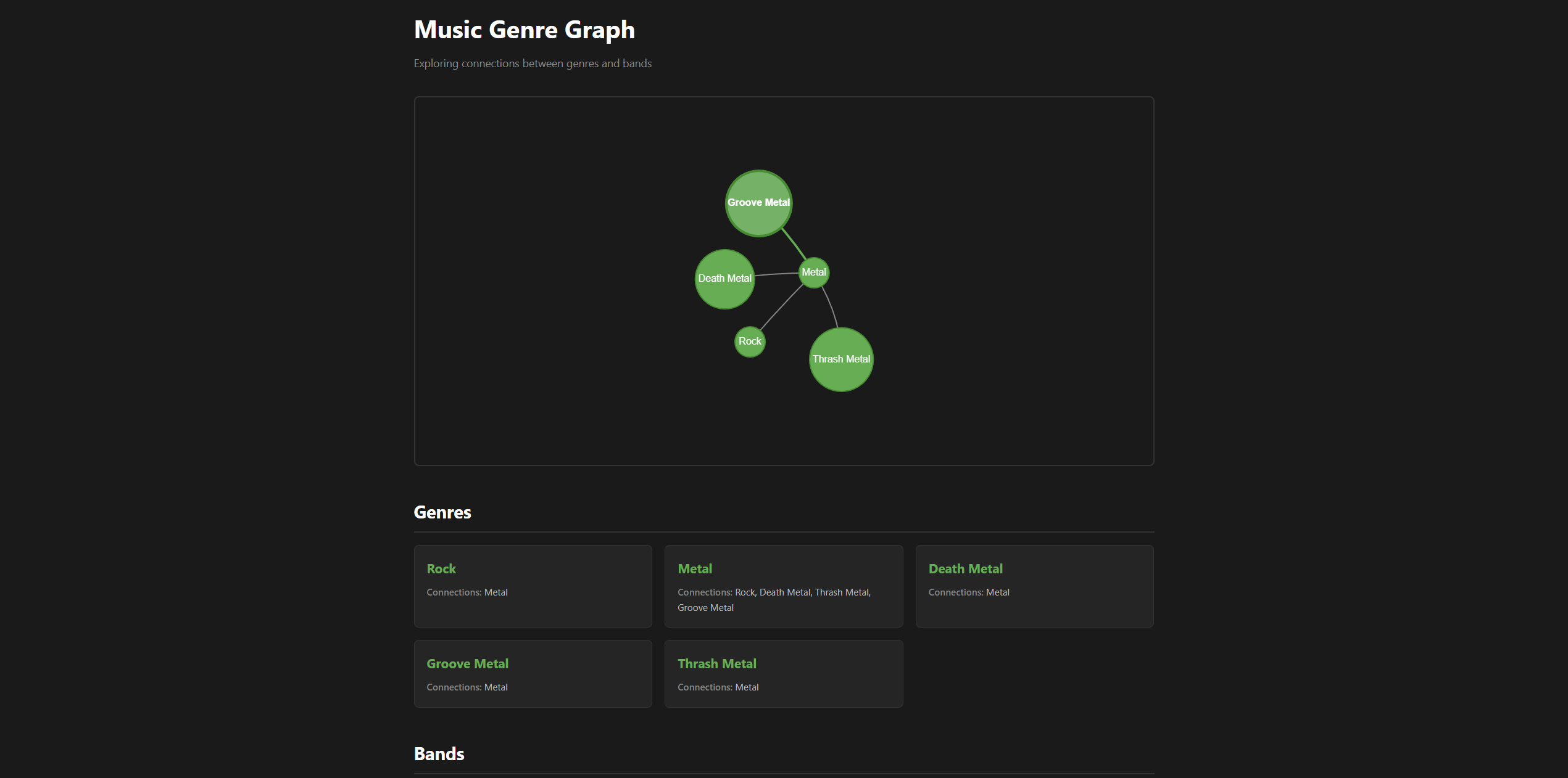
Metal sits in the center (most connections), with sub-genres (Death Metal, Thrash Metal, Groove Metal) connected to it, and Rock connected to Metal.
What I Learned
- JavaScript visualization libraries follow similar patterns to network diagramming tools
- Moving logic from templates to Python makes code cleaner and easier to debug
- Vis.js handles a lot of complexity (layout, physics, rendering) out of the box
- My networking background translated well to graph visualization concepts
Next Steps
Phase 1 isn’t quite done:
- Add bands to the graph (smaller nodes connected to genres)
- Improve styling (different colors/sizes for node types)
- Maybe add interactivity (click to highlight connections)
Then Phase 2: move from dictionaries to an actual database.
For now, the core visualization is working. The concept is proven.
This is part of the Music Genre Graph project series. See the project introduction for the full roadmap.